Goggle Chrome's new logo became a meme fest for netizens, see other 4 times companies logo's which has become a massive fail for public
By Lokmat English Desk | Published: February 9, 2022 11:42 AM2022-02-09T11:42:47+5:302022-02-09T11:43:30+5:30
After 8 long years Tech giant Google, for the first time decided to change its logo. Elvin Ho, a ...
Goggle Chrome's new logo became a meme fest for netizens, see other 4 times companies logo's which has become a massive fail for public
After 8 long years Tech giant Google, for the first time decided to change its logo. Elvin Ho, a designer at Google Chrome, describe the changes that has been done in the new logo, Ho said, “Some of you might have noticed a new icon in Chrome’s Canary update today. Yes! we’re refreshing Chrome’s brand icons for the first time in 8 years. The new icons will start to appear across your devices soon.”
The designer further explained, “We simplified the main brand icon by removing the shadows, refining the proportions and brightening the colors, to align with Google's more modern brand expression.”
The Chrome designer further said on Twitter “You might ask, “why bother with sth. so subtle?” We tailor Chrome’s experience to each OS, with features like Native Window Occlusion on Windows, day-one M1 support on macOS, Widgets on iOS/Android, and Material You on Android. We want our brand to convey the same level of care.”
As soon as the company launched its new logo netizens started to react as the logo looks the same and not many changes have been seen in it. The people make it meme fest, see what netizens has to say
#GoogleChrome new logo vs old logo pic.twitter.com/F3gVaQHL0R
— 👻MOGAMBO KHUSH HUA👻 (@MOGAMBO_TWEETS) February 6, 2022
Him : I have changed a lot !
— ANMOL KAUR (@anmol_banga) February 6, 2022
Also him:#GoogleChromepic.twitter.com/M0erGuyqLf
After seeing the Google chrome logo change: pic.twitter.com/or6xEP1fq3
— Falebi Jafda (@GoggleWalaMemer) February 6, 2022
The logo of Google Chrome is getting darker just like my future !#GoogleChromepic.twitter.com/MmN8HyfZGx
— Shivam Pratap Singh (@Shivampratap018) February 7, 2022
See, the other logos which were a massive fail for the companies
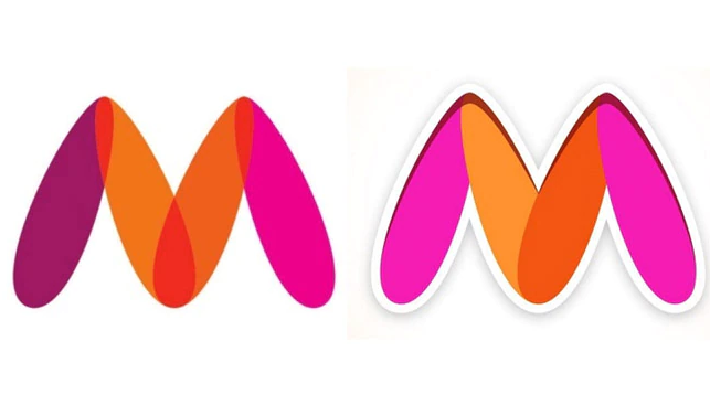
1. MYNTRA
After a Mumbai-based activist registered a complaint against the Myntra logo the company decided to change its icon. The complaint stated that the placement of the color scheme depicted a woman’s vagina. Specifically, the dark orange center is interpreted as a woman spreading her legs in a suggestive manner. Later the company changed its logo to the alphabet ‘M’ with different shades of pink and orange.
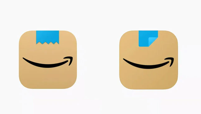
2. AMAZON
In January 2021 Amazon changed its logo with a strip of blue tape over its existing arrow. Which didn't went well with the netizens one user said "It’s not just a ripped Scotch tape, it’s a ripped Scotch tape that has a similar shape and is right on top of a smiling mouth - Looks like a happy little cardboard Adolf to me."
3. CALENDLY
According to reports, CALENDLY spent about US $1.5 million on its logo. But unfortunately is was the massive fail. Many users commented that the first word 'C' is looking like a toilet.
hold on.. calendly spent $1.5M on a new logo that looks like a bird’s-eye view of a toilet?
— Jay ( 🚀 , 🦔 ) (@MisterJHuffman) June 14, 2021
lmao, fire whoever made that decision yesterday. pic.twitter.com/lYjW5o9c5J
4. META
A German company M-sense Migräne in October 2021 changed its logo. The company tweeted "We are very honoured that Facebook felt inspired by the logo of our migraine app - maybe they’ll get inspired by our data privacy procedures as well." But it became the meme fest for the netizens one user commented that "One can fix the migraine the other is going to give me."
We are very honoured that @facebook felt inspired by the logo of our migraine app - maybe they’ll get inspired by our data privacy procedures as well 👀 🤓
— M-sense Migräne (@msense_app) October 29, 2021
#dataprivacy#meta#facebookpic.twitter.com/QY7cota36r
Open in app